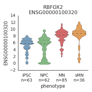
Plot expression of a gene in all phenotypes
In each column of the phenotype, the pooled samples are plotted as black dots and the outliers are plotted as grey shadows.
Python source code: [download source: plot_gene.py]
import flotilla
study = flotilla.embark(flotilla._neural_diff_chr22)
study.plot_gene('RBFOX2')