Accurate estimation of alternative splicing modalities
As shown in previous work (Shalek+Satija et al 2013), the majority of alternative splicing in single cells is all or nothing - either the included isoform or the excluded isoform. Rarely are there genes whose included/excluded isoforms are held at a 50/50 ratio. However, it is unclear what fraction of transcripts are maintained at specific proportions across cells, and we aim to categorize these splicing events into five bins: included, middle, excluded, bimodal, and uniform.
First, let’s import the modules we’ll need.
%matplotlib inline

import os

import matplotlib.pyplot as plt
import numpy as np
import pandas as pd
import seaborn as sns
sns.set(context='notebook', style='ticks')

from flotilla.compute.splicing import ModalityEstimator, ModalityModel
from flotilla.visualize.splicing import ModalitiesViz
And initialize a ModalityEstimator for performing the calculations, and a ModalityViz for visualizing the results.
modality_estimator = ModalityEstimator(step=1, vmax=10)
modality_visualizer = ModalitiesViz()
Next, let’s plot the modalities we are modeling as violin plots. We model splicing events’ “percent spliced-in” or Psi/\(\Psi\) as following a Beta distribution:
Where \(B(\alpha, \beta)\) is the Beta *function*, from which the Beta distribution gets its name,
The Beta distribution is perfect for splicing scores because ...
- It is continuous between 0 and 1, so any and all new splicing events we encounter are always valid by the model
- Its parameters, \(\alpha\) and \(\beta\) can be tuned to create the characteristic modalities we are interested in
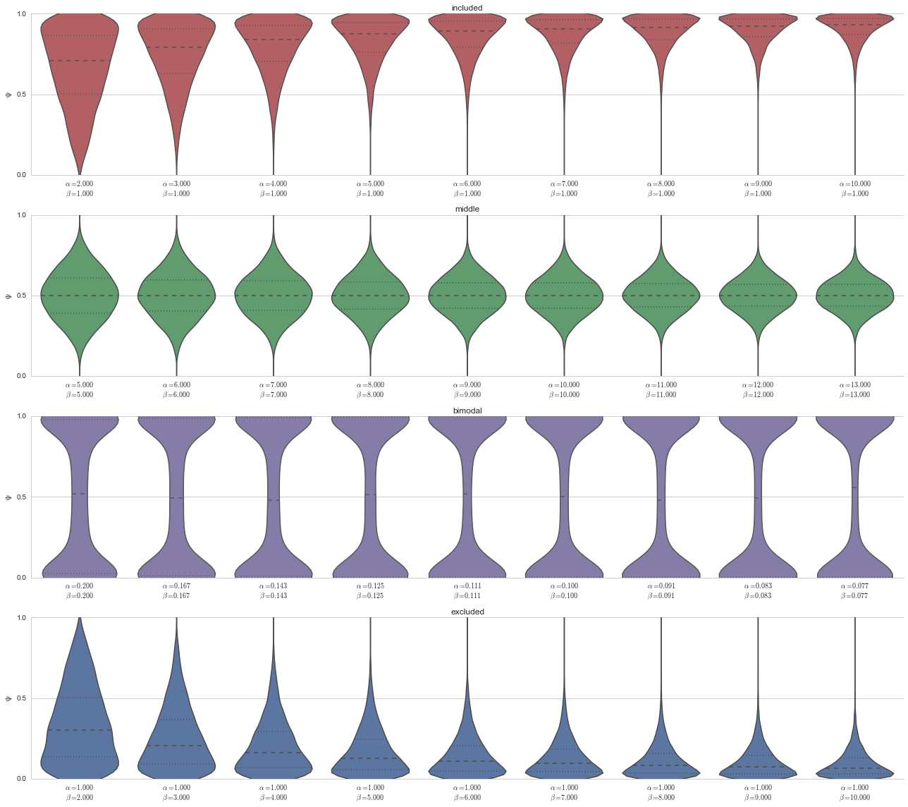
Specifically, we can model the included, middle, excluded, or bimodal modalities. In the plot below, note that only the first four are actually in the model, and that the uniform distribution was separately created. This is because the uniform distribution cannot be parameterized, it is exactly when \(\alpha=1\) and \(\beta=1\), and as every splicing event has exactly the same probability under the uniform distribution, \(Pr_{\text{Uniform}}(\text{event})=1\), we will use the uniform distribution as our null model for testing.
fig, ax = plt.subplots(figsize=(2*5, 4))

n = 10000

# Use the last parameterization (we'll get to that next) in the model list of random variables "rvs"
model_data = pd.DataFrame({model_name: model.rvs[-1].rvs(n) for model_name, model in modality_estimator.models.items()})
model_params = pd.Series({model_name: model.rvs[-1].args for model_name, model in modality_estimator.models.items()})

# Add the uniform distribution
model_data['uniform'] = np.linspace(0, 1, num=n)

# Reorder the columns
columns_ordered = ['included', 'middle', 'bimodal', 'excluded', 'uniform']
model_data = model_data.reindex(columns=columns)

# Get modality colors
colors = [modality_visualizer.modality_colors[m] for m in model_data.columns]

# Rename the columns to include the alpha and beta parameters
modality_with_params_renamer = {model_name: '{}\n$\\alpha={:.2f}$\n$\\beta={:.2f}$'.format(model_name, alpha, beta)
 for model_name, (alpha, beta) in model_params.iteritems()}
modality_with_params_renamer['uniform'] = 'uniform\n$\\alpha=1$\n$\\beta=1$'
model_data = model_data.rename(columns=modality_with_params_renamer)

sns.violinplot(model_data, bw=0.2, color=colors)
ax.set_ylim(0, 1)
ax.set_ylabel('$\Psi$')
ax.set_yticks([0, 0.5, 1])
sns.despine()
fig.tight_layout()
---------------------------------------------------------------------------
NameError                                 Traceback (most recent call last)

<ipython-input-3-11a1560f754c> in <module>()
     12 # Reorder the columns
     13 columns_ordered = ['included', 'middle', 'bimodal', 'excluded', 'uniform']
---> 14 model_data = model_data.reindex(columns=columns)
     15
     16 # Get modality colors


NameError: name 'columns' is not defined
/home/travis/miniconda/envs/testenv/lib/python2.7/site-packages/matplotlib/font_manager.py:1282: UserWarning: findfont: Font family [u'Helvetica', u'Arial'] not found. Falling back to Bitstream Vera Sans
  (prop.get_family(), self.defaultFamily[fontext]))
Parameterizations of Bayesian model
We will employ a Bayesian model to do a (very non-exhaustive) “grid search” of parameter space for splicing events. Meaning, given a particular splicing event, does it match one of these modalities’ parameterizations?
fig, axes = plt.subplots(nrows=nrows, ncols=1, figsize=(2*ncols, 4*nrows))

n = 10000

for ax, (model_name, model) in zip(axes, modality_estimator.models.items()):
    parameterizations = [rv.rvs(n) for rv in model.rvs]
    color = modality_visualizer.modality_colors[model_name]
    xticklabels = ['$\\alpha={:.3f}$\n$\\beta={:.3f}$'.format(a, b) for a, b in zip(model.alphas, model.betas)]
    sns.violinplot(parameterizations, bw=0.2, color=color, names=xticklabels, #color=colors,
                   ax=ax)
    ax.set_ylim(0, 1)
    ax.set_ylabel('$\Psi$')
    ax.set_yticks([0, 0.5, 1])
    ax.set_title(model_name)
fig.tight_layout()
sns.despine()
Prior probability on parameterizations
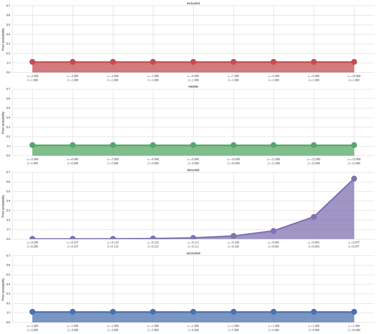
We use a uniform prior on all parameterizations except the bimodal distribution. This is because through extensive testing, we have found that using a uniform prior on the bimodal distribution causes slightly noisy (+10% uniform noise) included and excluded splicing events to be called “bimodal,” and we want to eliminate false postives in the bimodal category.
fig, axes = plt.subplots(nrows=nrows, ncols=1, figsize=(2*ncols, 4*nrows), sharey=True)

n = 10000

n_params = 10

for ax, (model_name, model) in zip(axes, modality_estimator.models.items()):
    color = modality_visualizer.modality_colors[model_name]
    if model_name == 'bimodal':
        ymax = np.exp(np.arange(len(modality_estimator.parameters))).astype(float)
        ymax = ymax/ymax.sum()
    else:
        ymax = np.ones(len(modality_estimator.parameters)).astype(float)/len(modality_estimator.parameters)
    ymin = np.zeros(ymax.shape)
    x = np.arange(ymax.shape[0])
    ax.plot(x, ymax, 'o-', color=color, linewidth=5, markersize=20)
    ax.fill_between(x, ymin, ymax, color=color, alpha=0.75)
    ax.set_xlim(0, x.max())
    xticklabels = ['$\\alpha={:.3f}$\n$\\beta={:.3f}$'.format(a, b) for a, b in zip(model.alphas, model.betas)]
    ax.set_xticks(x)

    ax.set_ylabel('Prior probability')

    ax.set_xticklabels(xticklabels)
    ax.set_xlim(x.min()-0.5, x.max()+0.5)
    ax.set_title(model_name)

fig.tight_layout()
sns.despine()
Testing modality estimation
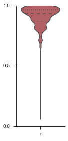
To show that this framework is accurate, we start with a “perfect” event, which uses the last parameterization of each model, which is the “most extreme” version of that model under our assumptions.
n = 100
event = pd.Series(modality_estimator.inclusion_model.rvs[-1].rvs(n))


sns.set(style='ticks')
fig, ax = plt.subplots(figsize=(2, 4))
sns.violinplot(event, ax=ax, bw=0.2, color=modality_visualizer.modality_colors['included'])
ax.set_ylim(0, 1)
ax.set_yticks([0, 0.5, 1])
sns.despine()
fig.tight_layout()
Let’s estimate the modality of this event by calculating the log-likelihood of each parameterization using modality_estimator._loglik, and summing the results using modality_estimator._logsumexp.
logliks = modality_estimator._loglik(event)
logsumexps = modality_estimator._logsumexp(logliks)

# Visualize the events
plotter = modality_visualizer.event_estimation(event, logliks, logsumexps)
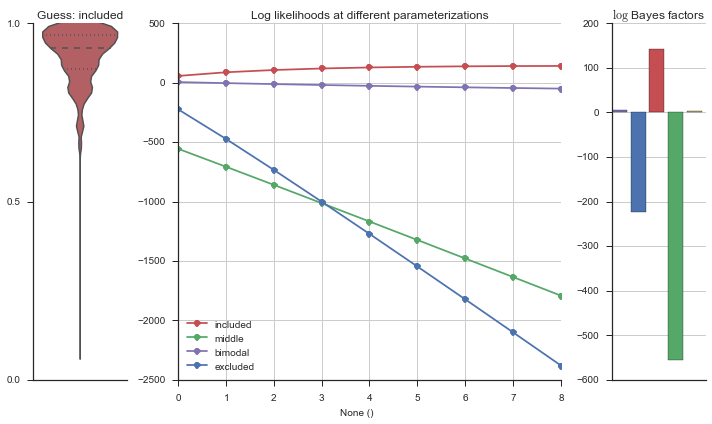
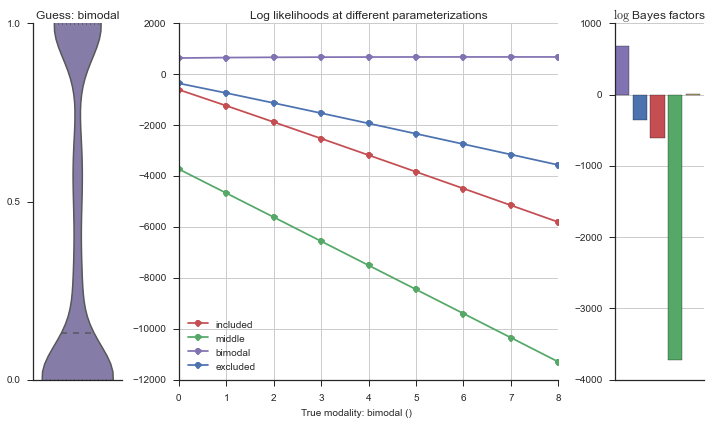
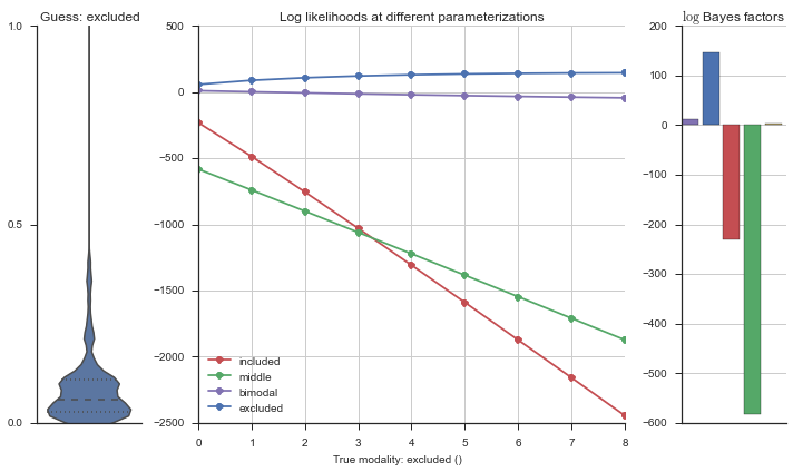
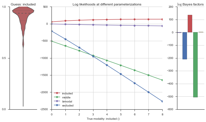
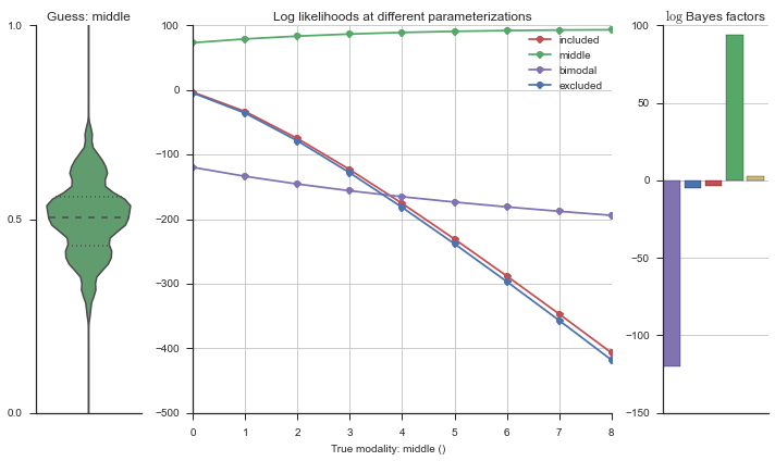
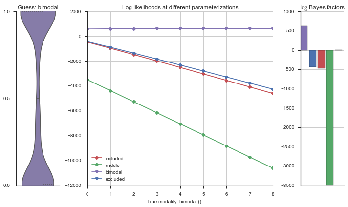
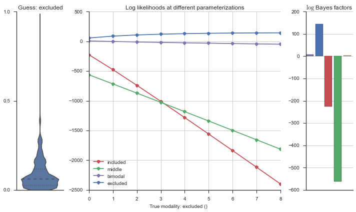
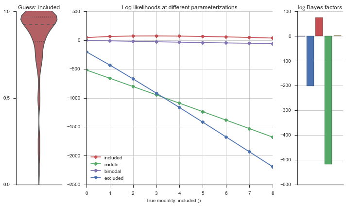
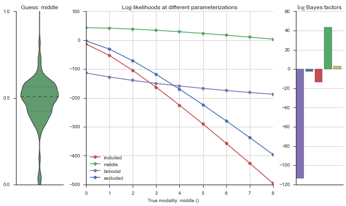
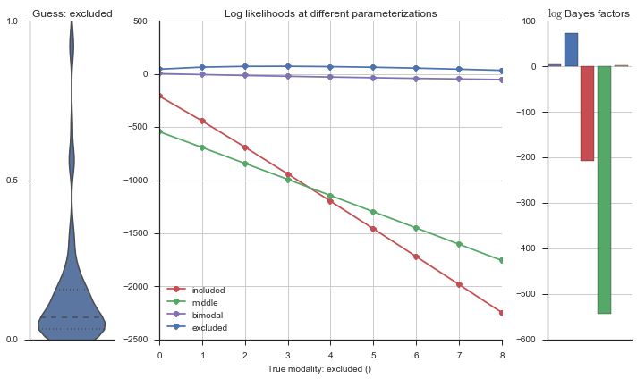
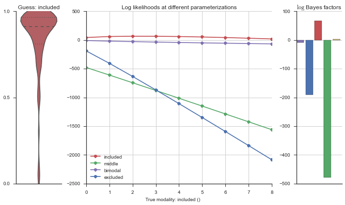
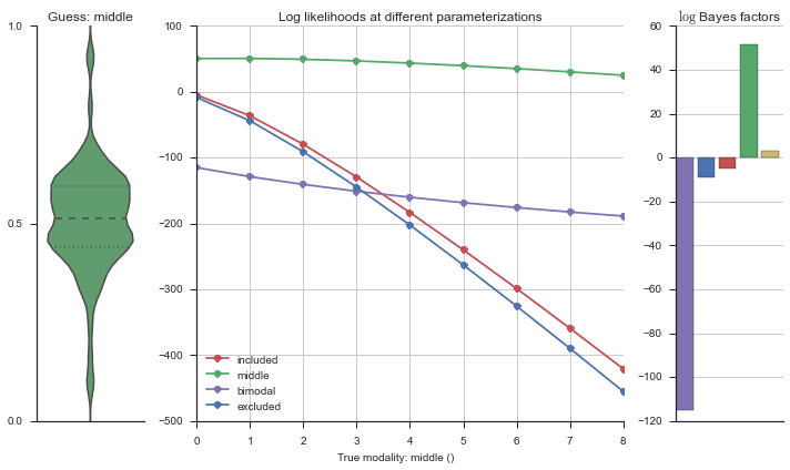
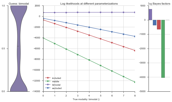
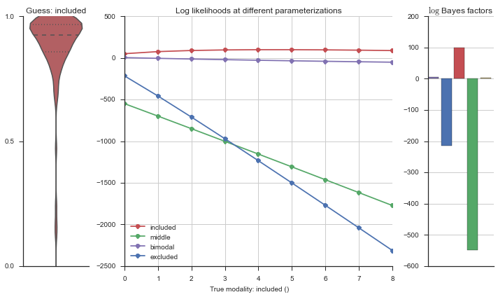
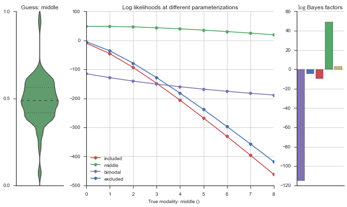
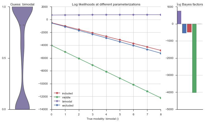
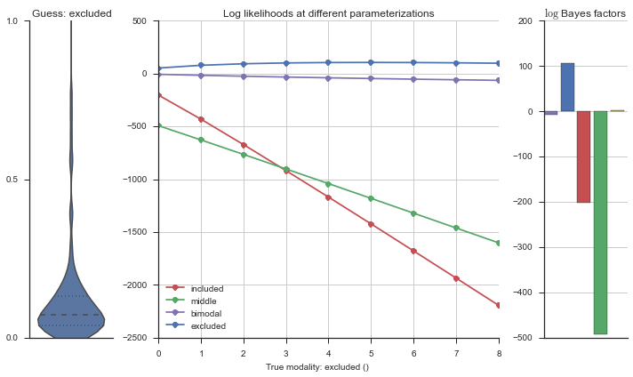
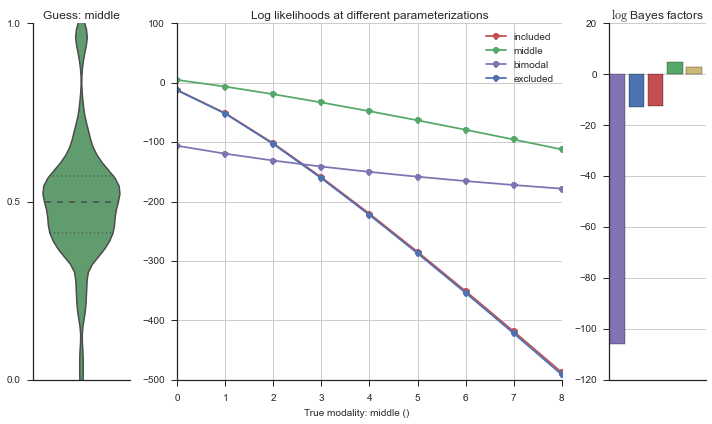
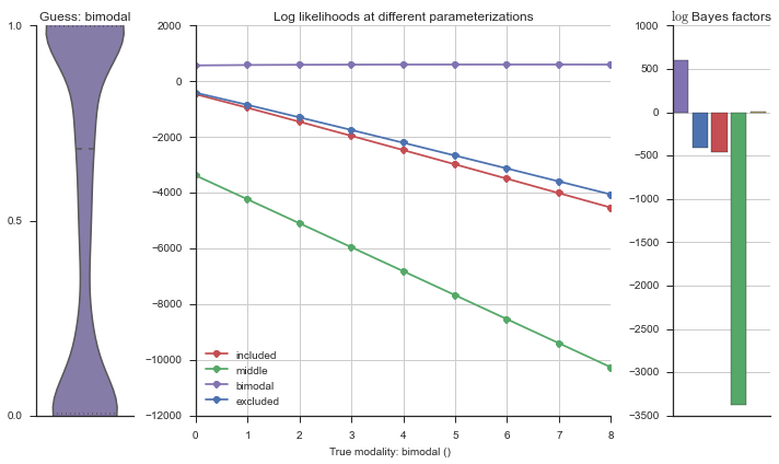
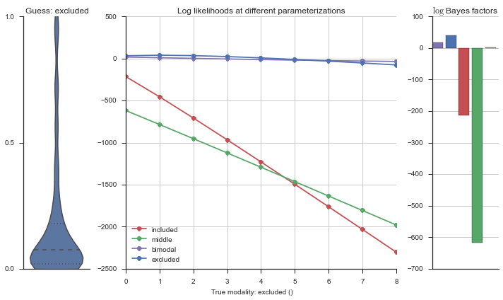
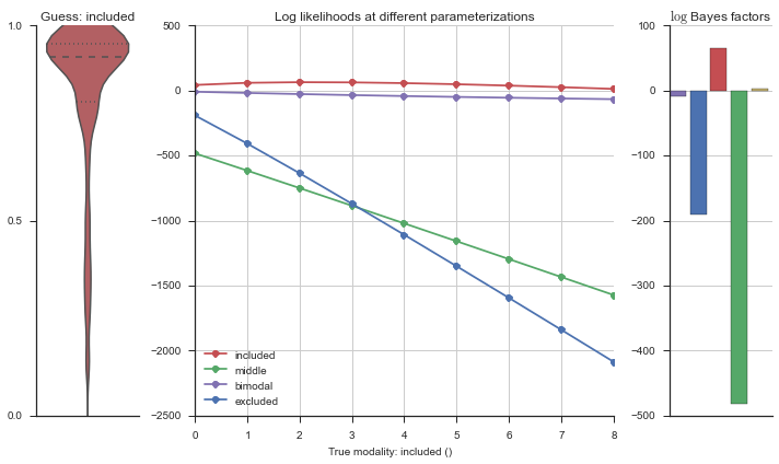
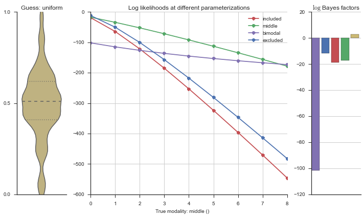
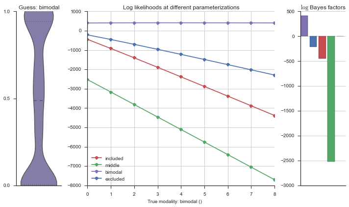
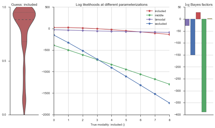
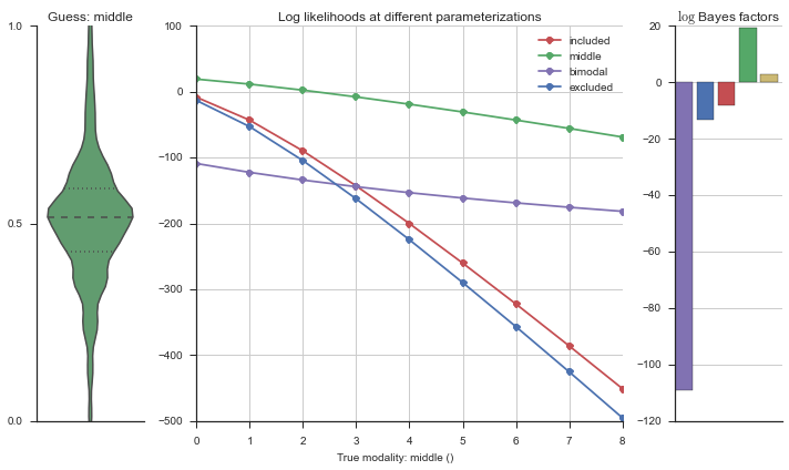
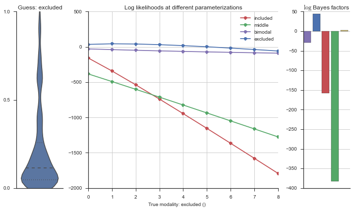
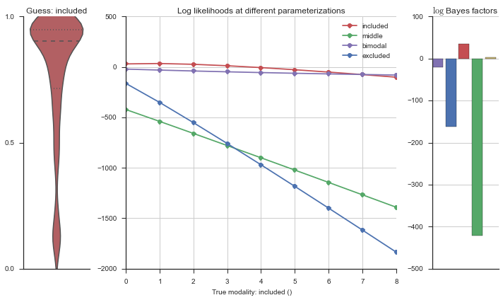
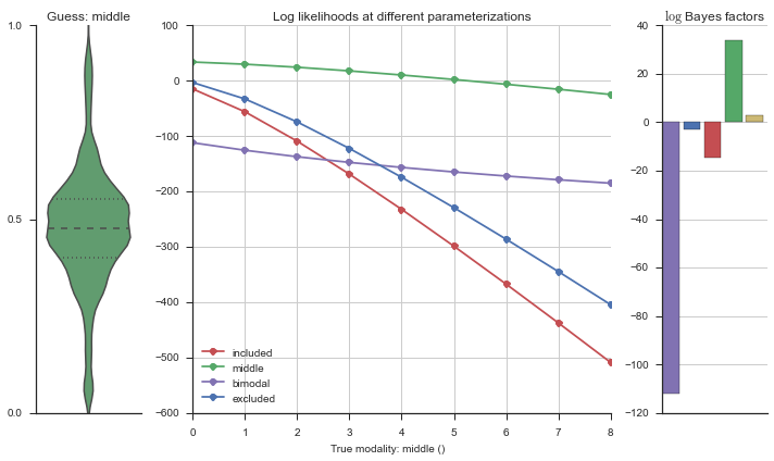
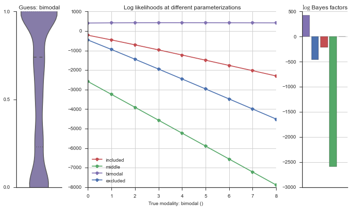
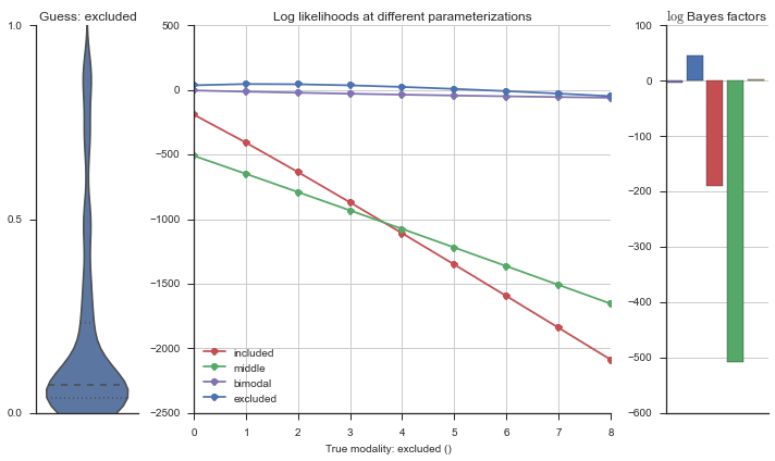
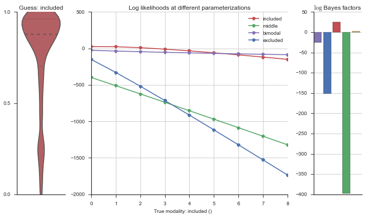
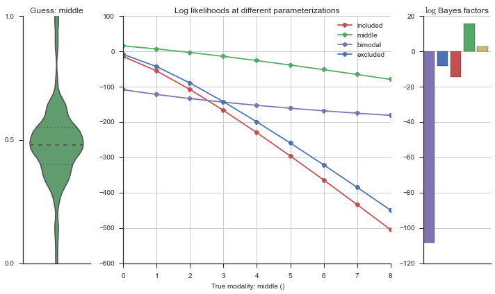
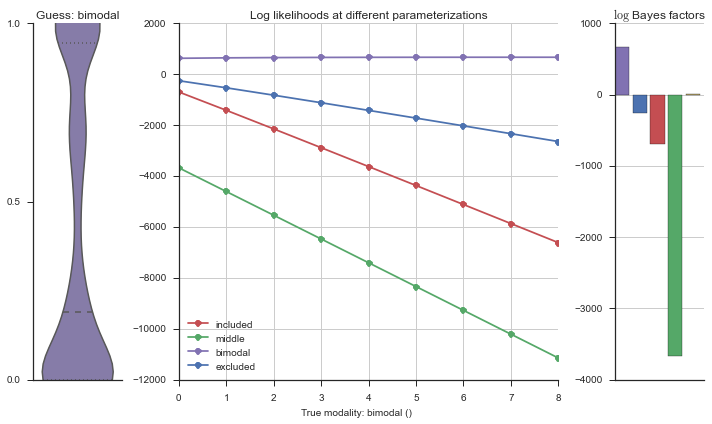
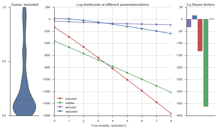
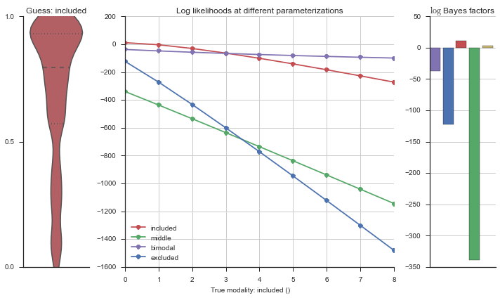
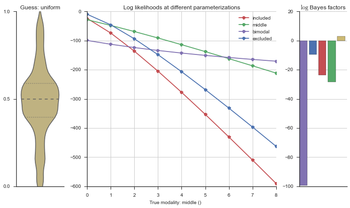
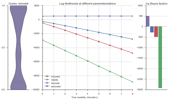
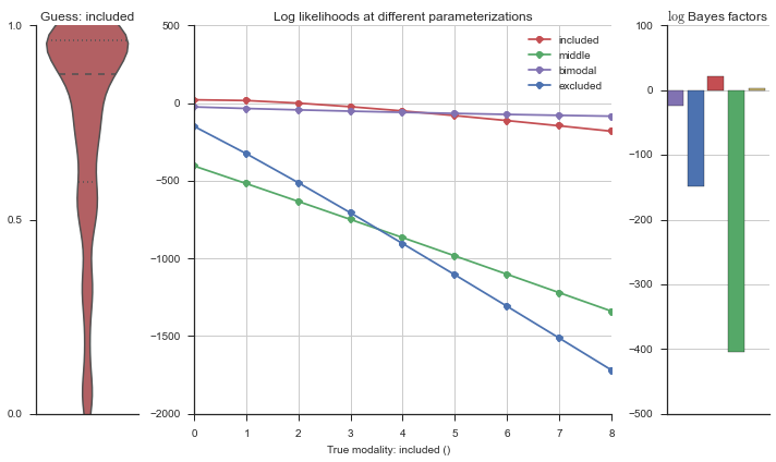
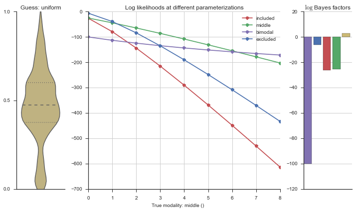
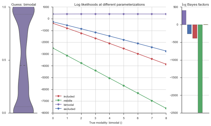
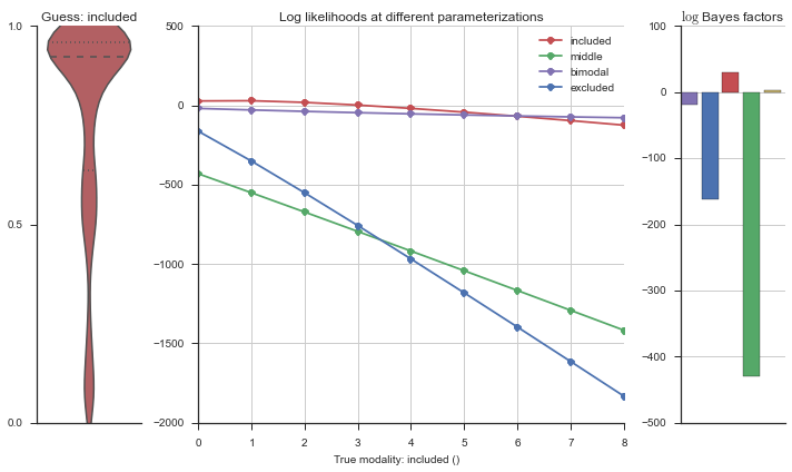
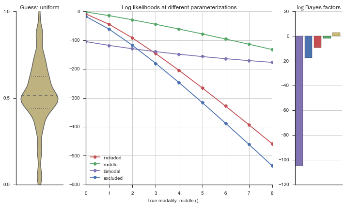
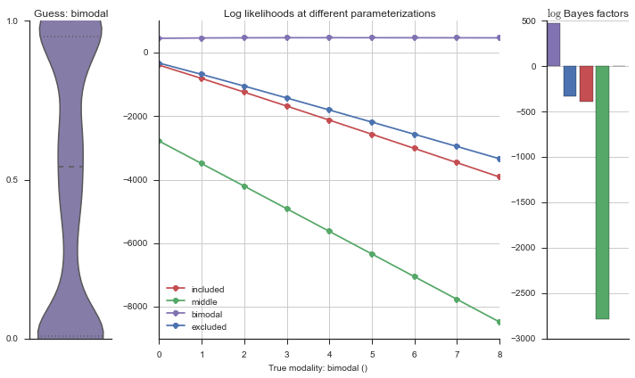
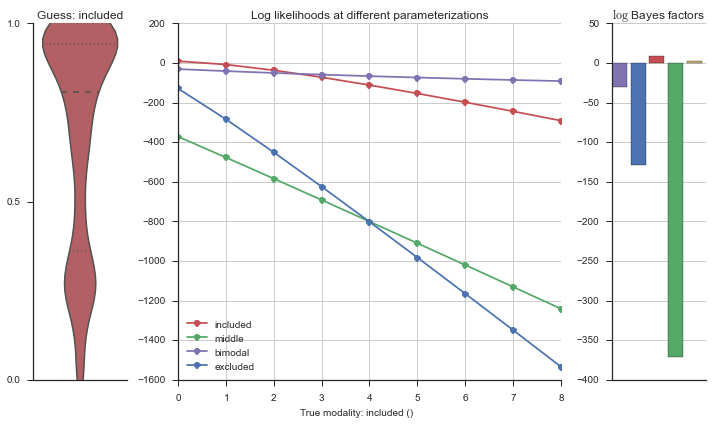
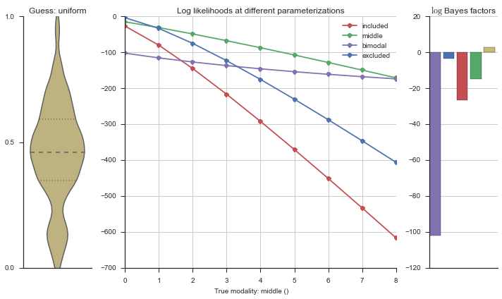
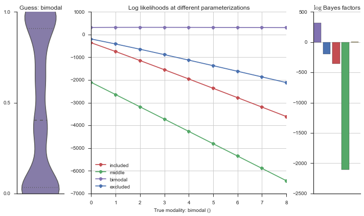
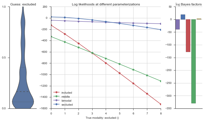
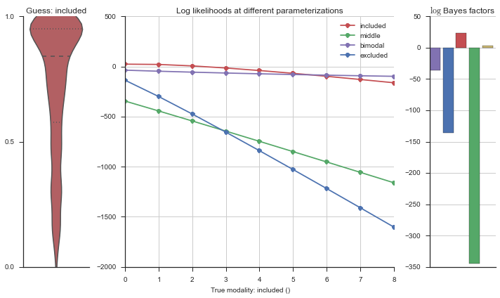
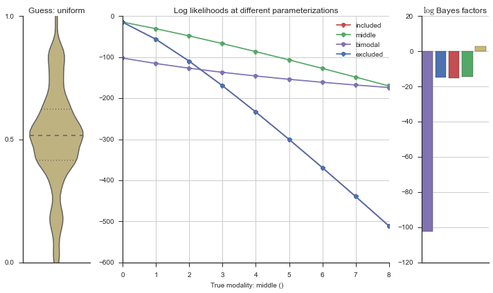
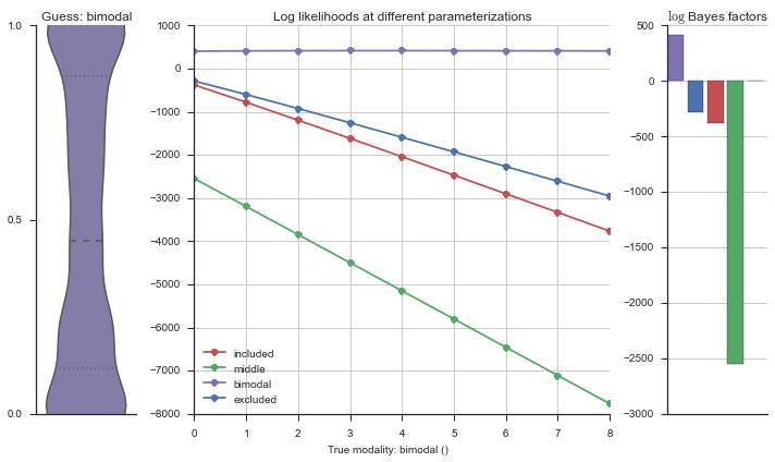
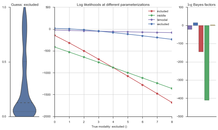
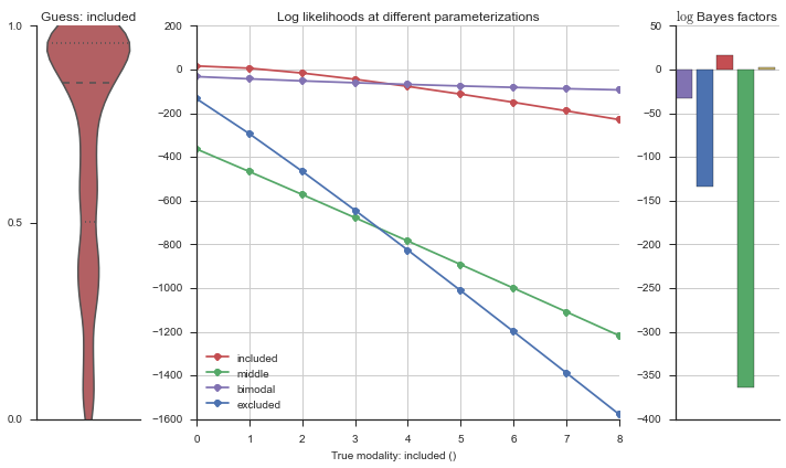
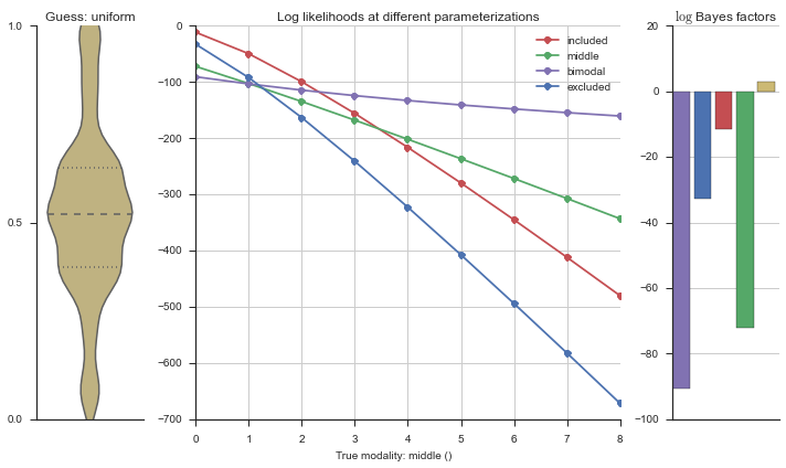
The left panel shows a violinplot of the event. The middle panel shows the log-likelihoods of different models at increasing parameterizations. The right panel shows the total summed Bayes factors of how much more likely a model is over the uniform distribution, where the cutoff for a guessing that something is a uniform distribution is a \(\log_2\left(\text{Bayes factor}\right) > 3\).
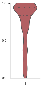
Let’s add add random noise to the “perfect” included event, and see how that changes the modality estimation.
sns.set(style='ticks')
fig, ax = plt.subplots(figsize=(2, 4))
event_noisy = event.copy()
event_noisy[:50] = np.random.uniform(size=50)

sns.violinplot(event_noisy, ax=ax, bw=0.2, color=modality_visualizer.modality_colors['included'])
ax.set_ylim(0, 1)
ax.set_yticks([0, 0.5, 1])

sns.despine()
fig.tight_layout()
logliks = modality_estimator._loglik(event_noisy)
logsumexps = modality_estimator._logsumexp(logliks)

# Visualize the events
plotter = modality_visualizer.event_estimation(event_noisy, logliks, logsumexps)
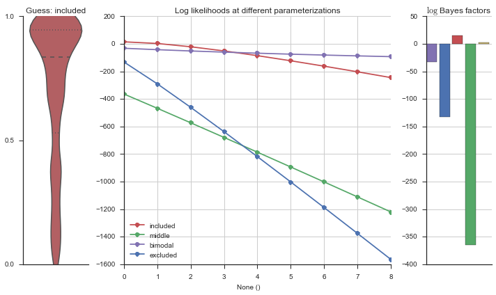
The included modality becomes less likely, but it still beats out the uniform and bimodal distributions, which is what we want.
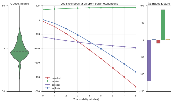
Let’s use this idea of noise to estimate modalities. We’ll use 100 cells total, and do 5 iterations of adding noise from 0% to 50%. We will visualize each estimation using the same modality_visualizer for the parameterizations. This will output quite a few plots.
# We will be writing incrementally to this "modality_guesses" file, because if
# this is done with many iterations and many noise levels, the file gets too
# big and the IPython kernel crashes
modality_guesses_csv = 'modality_guesses.csv'

# ALways start fresh with a new csv file
try:
    os.remove(modality_guesses_csv)
except OSError:
    pass

n_cells = 100
n_cell = n_cells
n_noisys = np.arange(0, 60, 10)

columns = ['prior', 'true_modality', 'guessed_modality', 'n_rogue', 'iteration']

df = pd.DataFrame(columns=columns)
df.to_csv(modality_guesses_csv, index=False)

for n_noisy in n_noisys:
    for i in range(5):
        rows = []
        for model_name, model in modality_estimator.models.items():
            rv = model.rvs[-1]
            event = pd.Series(rv.rvs(n_cells))
            event.name = 'True modality: {}'.format(model_name)

            event[:n_noisy] = np.random.uniform(size=n_noisy)

            n = len(modality_estimator.bimodal_model.prob_parameters)

            logliks = modality_estimator._loglik(event)
            logsumexps = modality_estimator._logsumexp(logliks)

            # Visualize the events
            plotter = modality_visualizer.event_estimation(event, logliks, logsumexps)
            filename = '{}_nnoisy{}_iter{}_bimodal_exponential_other_uniform_prior.pdf'.format(model_name, n_cell, n_noisy, i)
            plotter.fig.savefig(filename)
            rows.append(['bimodal_exponential_other_uniform', model_name, logsumexps.argmax(), n_noisy, i])

        modality_guesses = pd.DataFrame(rows, columns=columns)
        with open(modality_guesses_csv, 'a') as f:
            modality_guesses.to_csv(f, header=False, index=False)

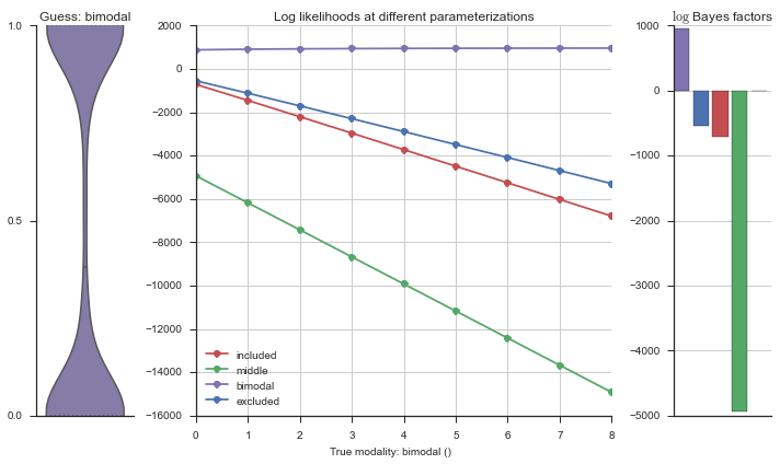
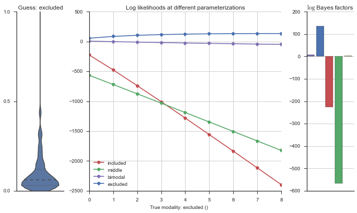
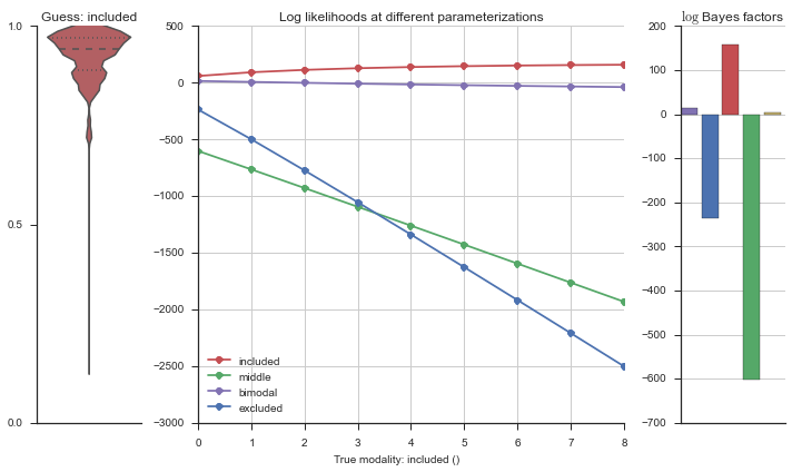
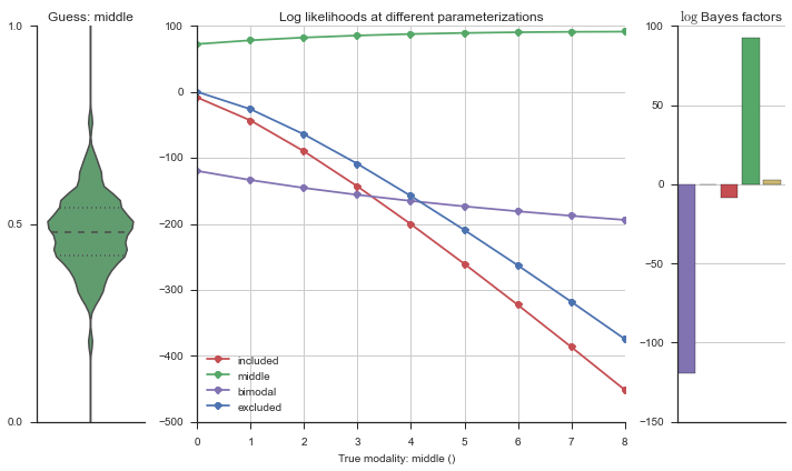
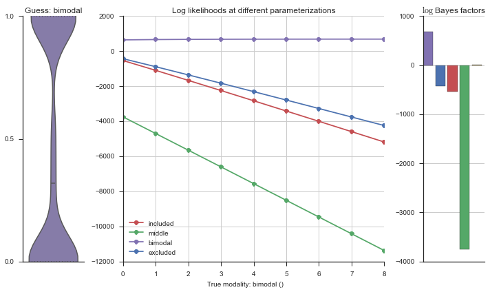
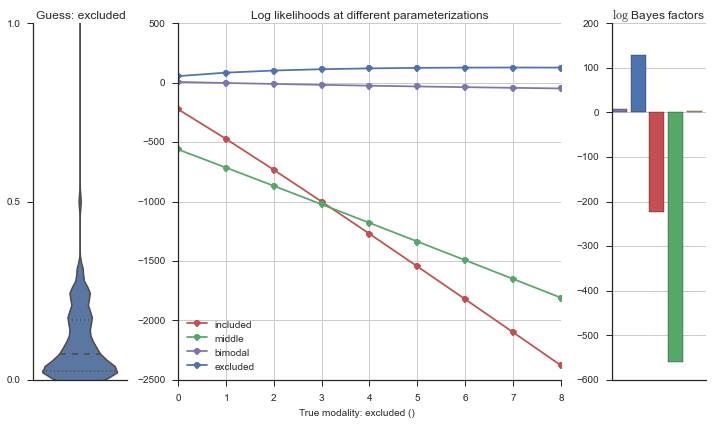
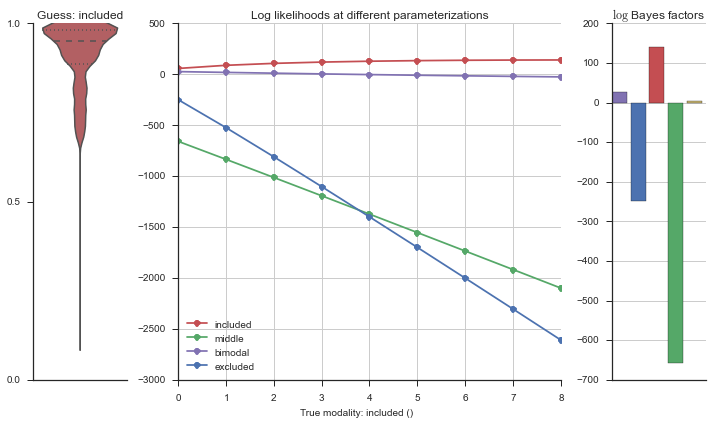
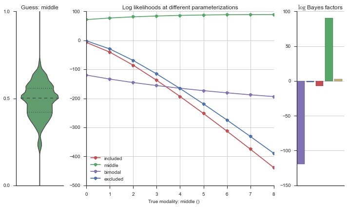
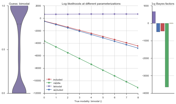
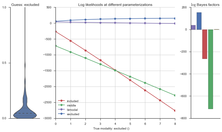
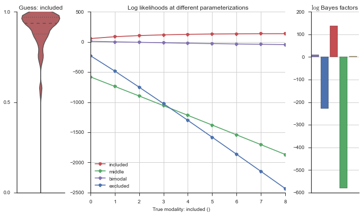
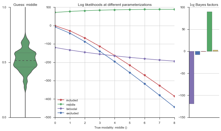
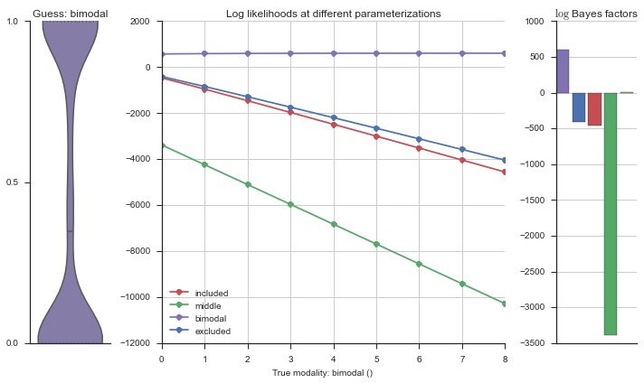

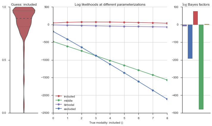
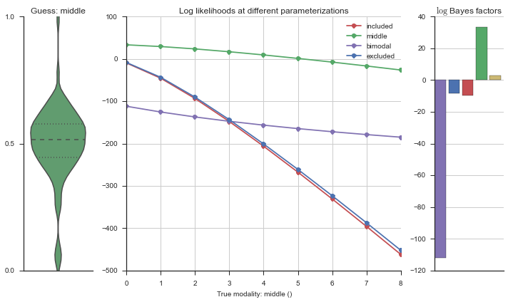
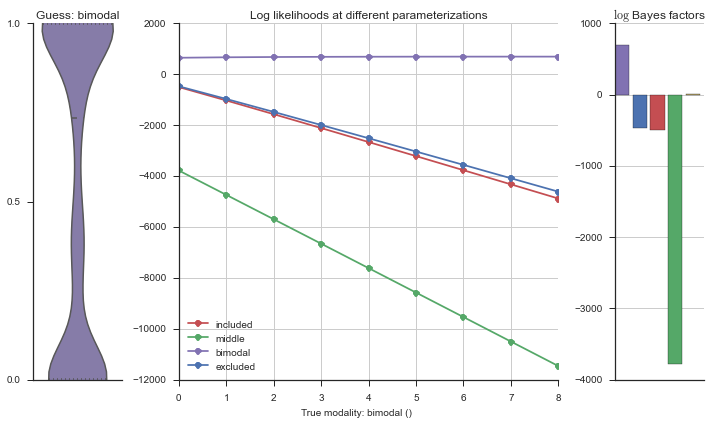
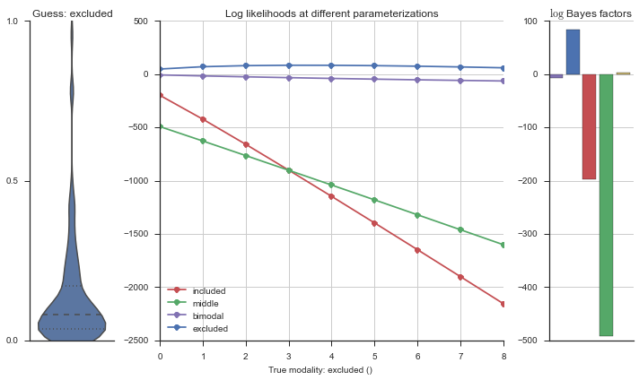
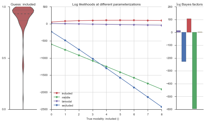
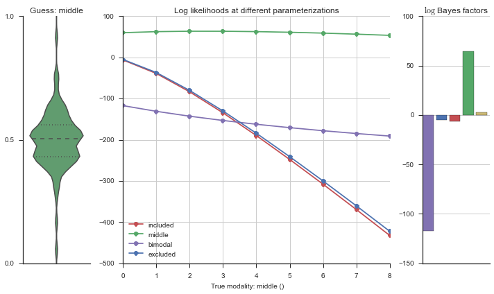
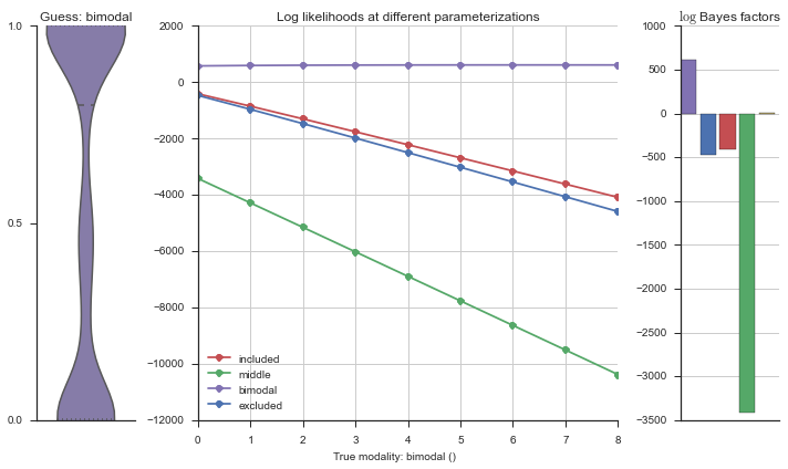

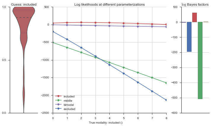
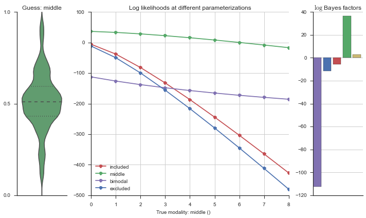

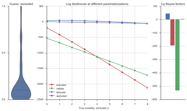
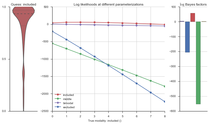
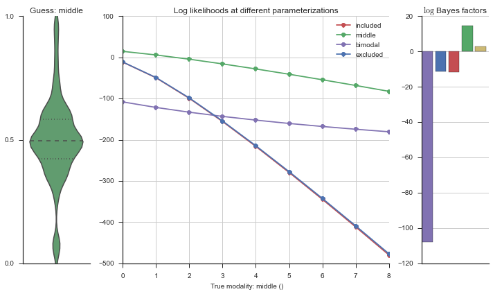
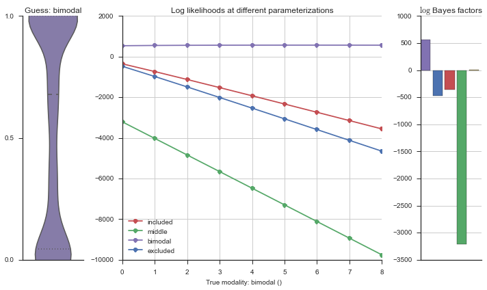
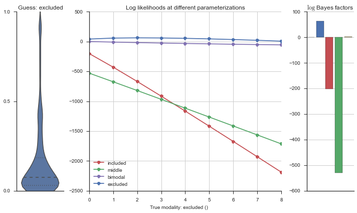
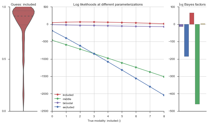
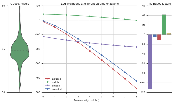
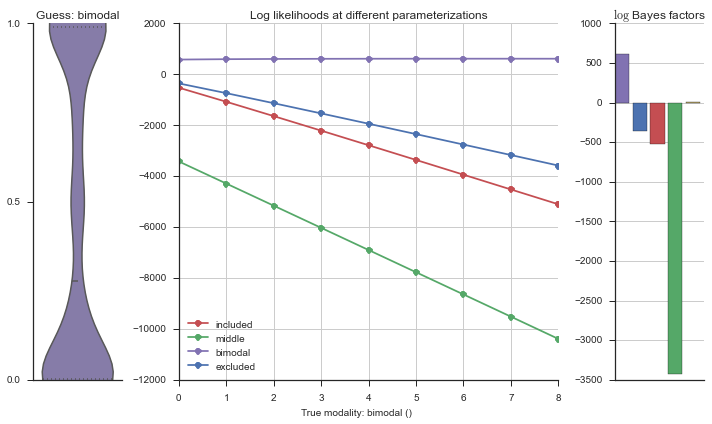
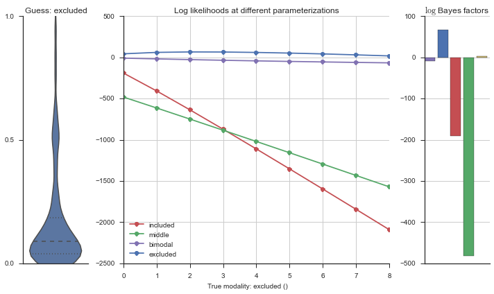
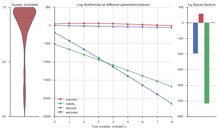
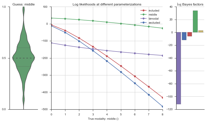
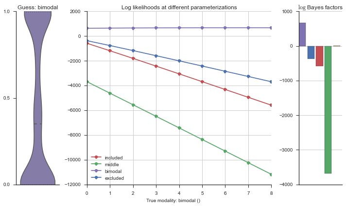
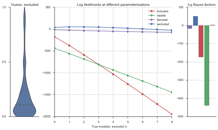
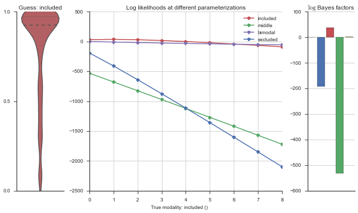

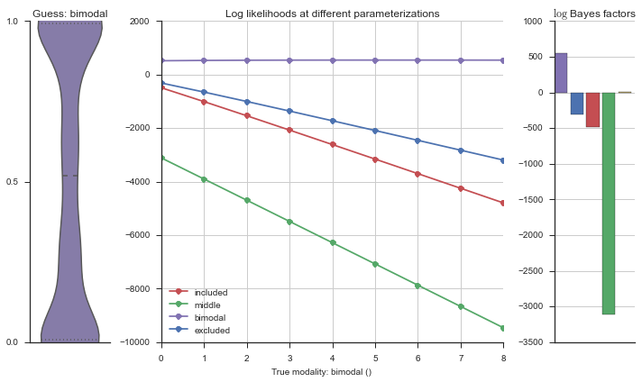

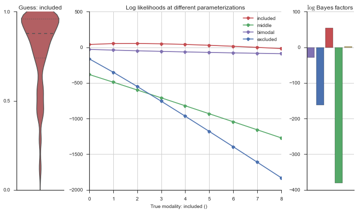
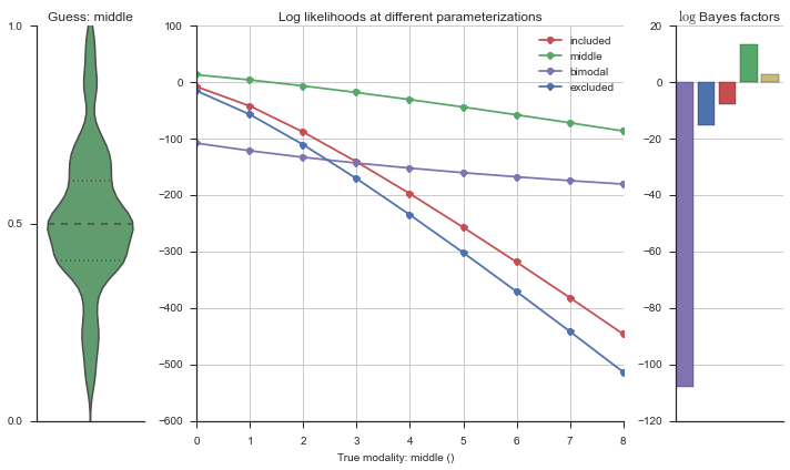
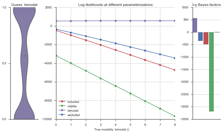
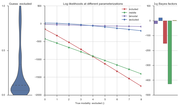
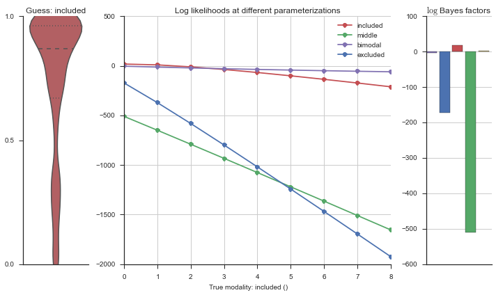
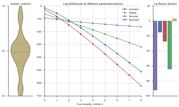
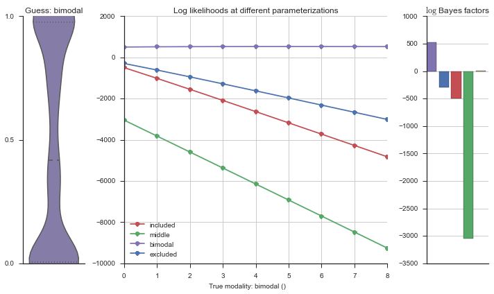
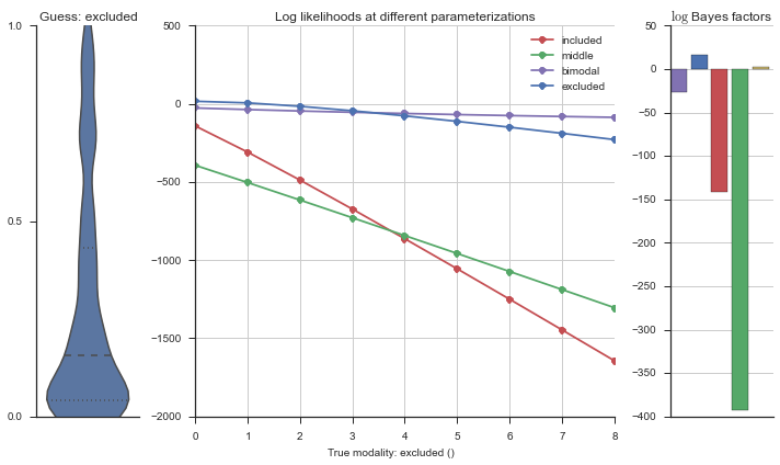
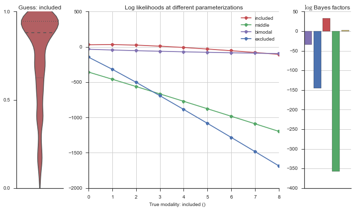
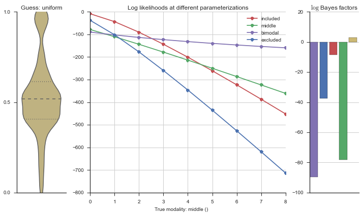
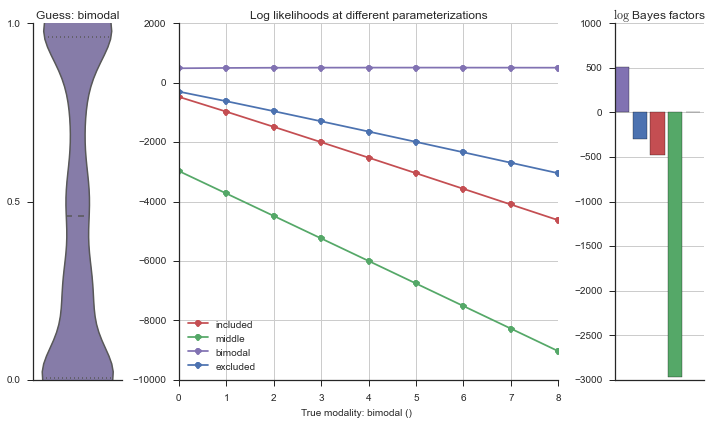



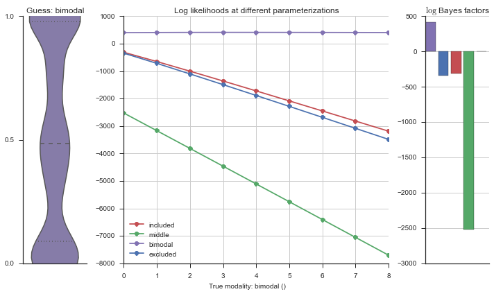
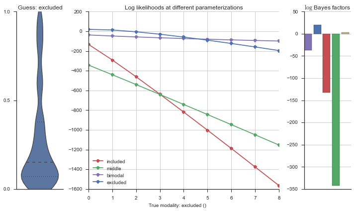
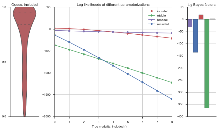
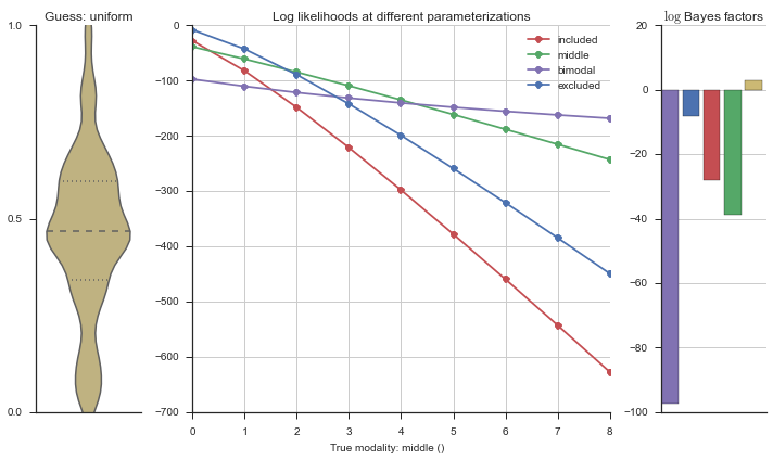
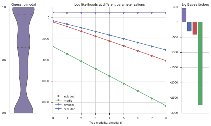
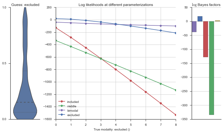
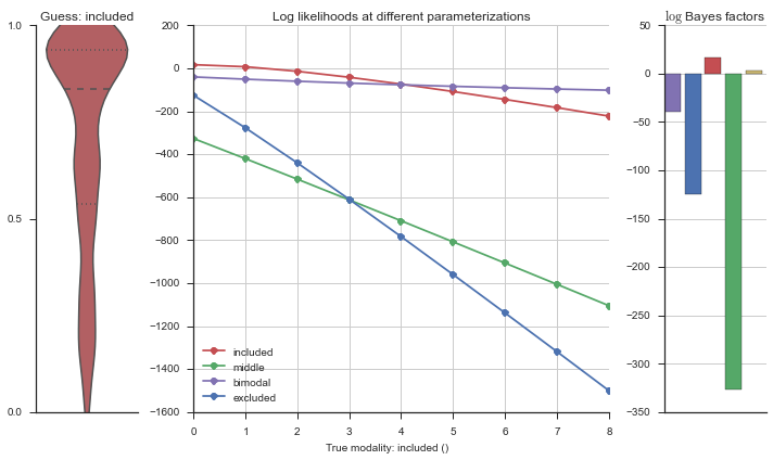
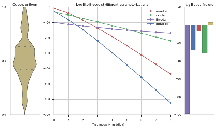
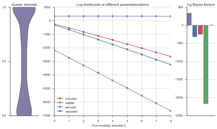
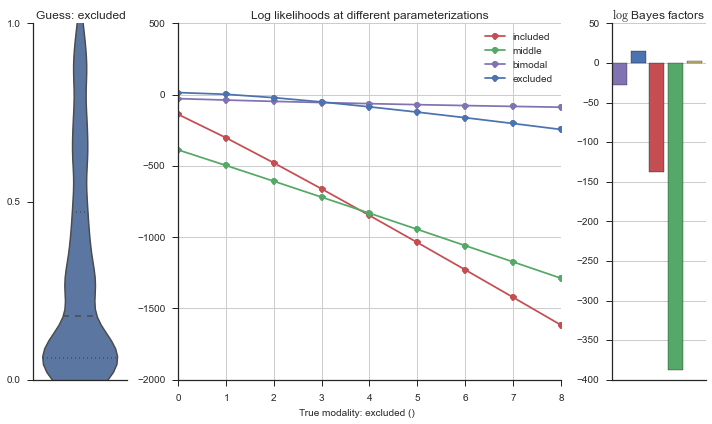
Now let’s plot the accuracy of the model on the increasingly noisy splicing events and their modality estimations.
modality_guesses = pd.read_csv(modality_guesses_csv)

model_accuracy = modality_guesses.groupby(['prior', 'n_rogue',
                                           'true_modality']).apply(lambda x: (x.true_modality == x.guessed_modality).sum())/n_noisys.max()*n_cells
model_accuracy = model_accuracy.reset_index()
model_accuracy = model_accuracy.rename(columns={0: 'percentage'})
fg = sns.factorplot('n_rogue', col='prior', data=model_accuracy, y='percentage', hue='true_modality',
               hue_order=('excluded', 'middle', 'included', 'bimodal'), palette='deep', kind='point')
fg.fig.savefig('percent_noise_vs_true_positives.pdf')


false_positives = modality_guesses.groupby(['prior', 'n_rogue',
                                            'guessed_modality', 'true_modality']).apply(lambda x: (x.true_modality != x.guessed_modality).sum())/50
# false_positives = false_positives.unstack()
false_positives = false_positives.reset_index()
false_positives = false_positives.rename(columns={0: 'counts'})
false_positives.head()

fg = sns.factorplot('n_rogue', y='counts', row='prior', col='true_modality', hue='guessed_modality', data=false_positives,
               hue_order=('excluded', 'middle', 'included', 'bimodal', 'uniform'), palette='deep', size=6)
fg.fig.savefig('percent_noise_vs_false_positives_factorplot.pdf')
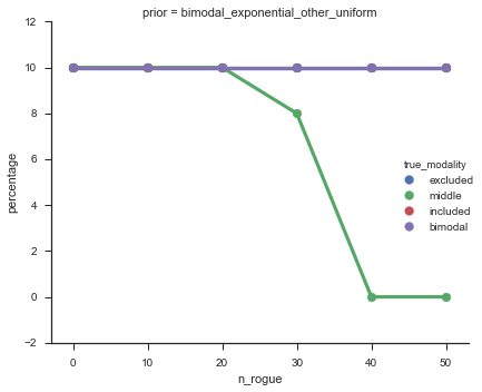

The “middle” modalities become less accurate at about 30% noise, but from looking at the events, I’m happy with these getting “mis-categorized” because they do truly look like “uniform” events.